Pair
A personality-oriented dating app


My role
I designed the product from end to end. My responsibilities included conducting user interviews, research synthesis, wireframing, creating user flows, designing high fidelity screens, and prototyping.
Scope
Conceptualization
UX design
UX research
Competitive analysis
Prototyping
Testing
Tools
Figma, Dovetail, Overflow
Duration
80 hours full time
Client
Academic project
Skip to:
The need
Dating apps have been an increasingly popular platform in the last 10 years. With the rise of Tinder, Hinge, Bumble, Coffee Meets Bagel, and other apps, people - especially young adults - have been flocking to these apps to try and connect with others after exhausting all their options from their existing social circle.
Tinder and other dating apps report a 10-15% increase from February to March of 2020 (DW, 2020)
“In 2021, Tinder ranked first…generating 15 million users, followed by Bumble with 8.5 million…and Plenty of Fish with 7.4 million downloads” (Trozenski, 2022)
The COVID19 pandemic has also caused a massive wave of people to turn to dating apps due to loneliness and social isolation. Despite the increase in usage of dating apps, users are confronted with several pain points.
The gap
To summarize the research findings, users who are on dating apps may feel negative emotions about dating rather than positive emotions such as excitement and optimism. I interviewed users who have had previous experience or are currently active on dating apps. Below are quotations pulled from the interviews that encapsulate key pain points that were gathered from research synthesis.
It's time-consuming.
People feel like it’s a part time job to swipe through profiles (Wong, 2020).
I feel like a commodity.
People feel superficial judging or being judged by others based on their physical appearance (Birch, 2018).
I hate when people ghost.
Users have to deal with much more rejection than usual on a daily basis (Brooks, 2022).
I wish I knew what my options were.
Users are experiencing decision paralysis due to having too many options to choose from (Birch, 2018).
Consented screenshot from a user interview

Research synthesis
Users unanimously agree that dating culture is an overarching pain point.
Profiles that emphasize physical appearance can cause room for judgment, hurt, insecurity, and the feeling of being seen as a commodity.
Hypothesis
Creating an application that prioritizes personality over appearance can directly improve dating app culture by redirecting emphasis from pictures to the overall personality of the profile. Adding prompts and intentionality behind how every profile is built can help users feel that they have opportunities to showcase their interests and personality rather than just their appearance.


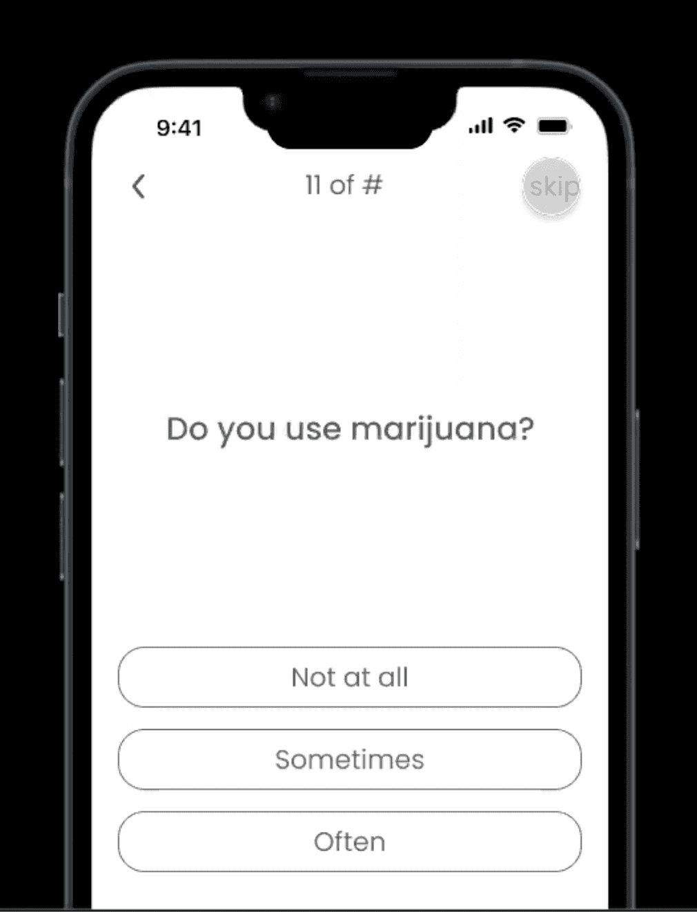
Ideation process
Below is a flow of sketches that I brainstormed after analyzing the insights from my initial research. I incorporated secondary research including competitive analysis to help me outline possible MVPs to consider adding to the design. By viewing competing dating apps currently on the market, I wanted to create a product that was familiar to users while still encapsulating a different and refreshing feel for users who were burnt out from existing dating apps.
For a closer look: https://overflow.io/s/ASYABUPL
Usability testing
After conducting user testing on the prototype, it was clear that a couple of changes regarding color, buttons, icons, and spacing needed to be made. Results of testing also indicated that different screens could be condensed into one or two screens in order for users to have a better sense of what to expect. For example, setting up background information could have all the questions on one screen so users can scroll up and down rather than having a progress bar to indicate how many screens are left.
Positive feedback from testing was given for the UI and branding of the application. Additionally, users enjoyed having prompts to guide them in the process of building their profile since they had the option to answer it through text or image. Users reacted positively regarding the chatrooms since it allowed them to exit conversations in a polite manner. Options to skip or go back to previous screens was appreciated due to existing dating apps not having that function.
Screenshot from a moderated session of testing
Iterating on UI
When exploring the different possibilities of what the heart icon should look like, I ruled out designs that may not be easily accessible for users considering the icon would be placed over a prompt card that could contain text or an image.
The outline with a white overlay was the best design choice because it would be visible regardless of what image would be in the background. Once the icon is tapped, it will have a copper fill to give feedback to the user that it was successfully tapped. Users who like a profile prompt would then be prompted to a modal to give an option to send a like or type a comment to the receiver.
Exploration


Assign state
Unliked
Liked
Navigation
Incorporate

User interaction
The biography section of every profile contains key information that may be the very reason why some users decide to connect with the person behind the profile or move on to the next.
The icons indicate what information is available for users to view on each profile's bio. Stacking the categories was one way to organize the information comprehensively.
Vaccination status
Alcohol usage
Height
Age
Education
Current location
Religious affiliation
Career
Home town
User interaction is critical to consider in order to determine which design choice to go with. This is because users may prefer swiping through the rows or viewing everything together all at once.
A

Would it be better to allow users to only swipe horizontally?
B

Do users want to refer to this part of the profile with a quick glance rather than having to swipe back and forth?
C

Should users be able to swipe horizontally and vertically?
The product
From the results of empathizing, defining, and iterating, I designed a high-fidelity clickable prototype to address the user’s pain points and needs. By focusing on the composition of each profile, users would be able to get to know other users on the app on a holistic level rather than just the physical aspect of each person, which happens to be a huge part of why dating app culture has been a pain point for several users.
For a closer look: https://overflow.io/s/ASYABUPL
Additionally, from the feedback I received from usability testing, I learned that allowing users to be “light onboarded” to give them the ability to view the app without committing to completing a profile was well received. An incomplete profile prevented them from getting quality matches but it still gave the user autonomy to understand the functionality of the application.
Learnings and takeaways
A. The importance of innovation
Due to existing dating apps in the market, I had to design an application that was different, easy to navigate, familiar amongst users, but unique at the same time.
Personally, as a previous user of dating apps, I wanted to incorporate my knowledge of dating culture into the results of the user interviews I conducted in order to add to the research and development of this design. Because of my familiarity with dating apps, I was able to explore similar yet unique ways to elevate the design of Pair.
B. UX focus with UI elements
Creating the overall user experience and designing an end to end application meant that I also needed to create UI elements, components, and branding from scratch. Without the focus of the project shifting entirely to UI, I wanted to ensure that it would still look appealing to users. I attempted to design with minimalism and simplicity to emulate the tone of modern apps.
Usability testing results indicated that users felt satisfied about the branding and UI of the application based on positive feedback. After creating components and completing the branding, I focused most of my efforts on the core user experience.
Next steps
With more time, I would like to implement an A/B test with product managers and developers for the different designs I have created for the profile bios. Further testing will help me determine which design of the profile biography would be most comfortable for users to tap and swipe through.
In addition, if the app was ever developed, it would be exciting to discuss with PMs different aspects of the app. For example, it could be a business tactic to allow users to tap back once before they are prompted to a screen that allows them to go back up to five times with a subscription. The screens below indicate what the back action on a free account might look like.
Based on research, users often felt frustrated when they accidentally skipped a profile or if they changed their mind after tapping next.


References
Birch, Jenna. “Are Dating Apps Creating Too Many Problems?” Psychology Today, (June 2018). https://www.psychologytoday.com/us/blog/navigating-the-love-gap/201806/are-dating-apps-creating-too-many-problems
Brooks, Amber. “25 Problems With Online Dating & How to Solve Them.” DatingAdvice.com, (March 2022). https://www.datingadvice.com/online-dating/problems-with-online-dating
DW [Sullivan, A.] (2020). “Love in the time of coronavirus: COVID-19 changes the game for online dating.” DW, https://p.dw.com/p/3a6I5
Trozenski, Abigail. “The Changing Spaces of Dating Apps since COVID-19.” The Center for Digital Humanities, (March 2022). https://www.vanderbilt.edu/digitalhumanities/the-changing-spaces-of-dating-apps-since-covid-19/
Wong, Britany. “The 6 Online Dating Issues People Complain About Most In Therapy.” The HuffPost, (February 2020). https://www.huffpost.com/entry/dating-app-problems_l_5e39bb35c5b6ed0033adad4c