Ideating a feature for high stakes emails in Microsoft Outlook
Skip to:
User Research
Based on the results of user interviews, people often feel it is necessary to get a second opinion on an email they are about to send. Usually, these emails are "high stakes"—situations where they are being sent to managers in higher positions at their work place, outgoing emails to clients, or other reasons such as applying to jobs or reaching out to recruiters. Conversely, when it comes to personal emails, users typically don't need to spend too much time drafting an email to a close friend or family member.
Bridging the gap
User interview
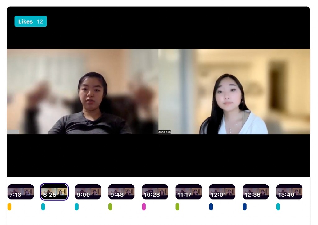
“If it’s the first email that I’m emailing someone or if it’s to a group of people, I’ll typically ask someone to read it over for me…Especially if it’s someone higher up than me in whatever way, I’ll ask someone to read over every email.”
With the need for collaboration, team work, feedback, critique, and communication between teams within companies, email has fallen behind on making it easily accessible for teams to do so. With a growing population working remotely, people are needing ways to manage and collaborate on their work more than ever.
Based on this pain point, how might we explore ways to add a feature for email sharing on platforms?
Why Microsoft Outlook?
In the United States, Microsoft Outlook is one of the most popular applications for companies to use. With the ease of grouping teams in different inboxes, organizing files, and scheduling on the Outlook calendar, businesses have been loyal to Microsoft Suites, especially Outlook and Teams with the rise of COVID-19.
I chose to add this collaboration feature to Outlook rather than any other emailing application due to the insights gathered from user interviews. Although Gmail is the most commonly used emailing application for personal reasons, when it comes to emails that need collaboration, it was on applications such as Microsoft Outlook or HubSpot. Since most users require feedback on email drafts for professional reasons rather than personal, it made the most sense to explore Outlook rather than Gmail, Yahoo, etc.
The exploration process
As I was sketching the different possibilities of how this feature could appear on the current interface of Outlook, I recognized the potential of how continuous exploration could help solidify the designs even more. With a variety of sketches including but not limited to modals, dropdown menus, different placements of the collaborate CTA, as well as other ideas regarding the UI of the feature, I was excited at the potential of what this design could mean for future Outlook users.
Existing UI
Considering the existing interface of Outlook, is it more consistent to keep the collaboration feature as a secondary button within Fluent UI? I explore this question by first sketching out the Outlook interface so I can have a fresh brainstorming canvas.
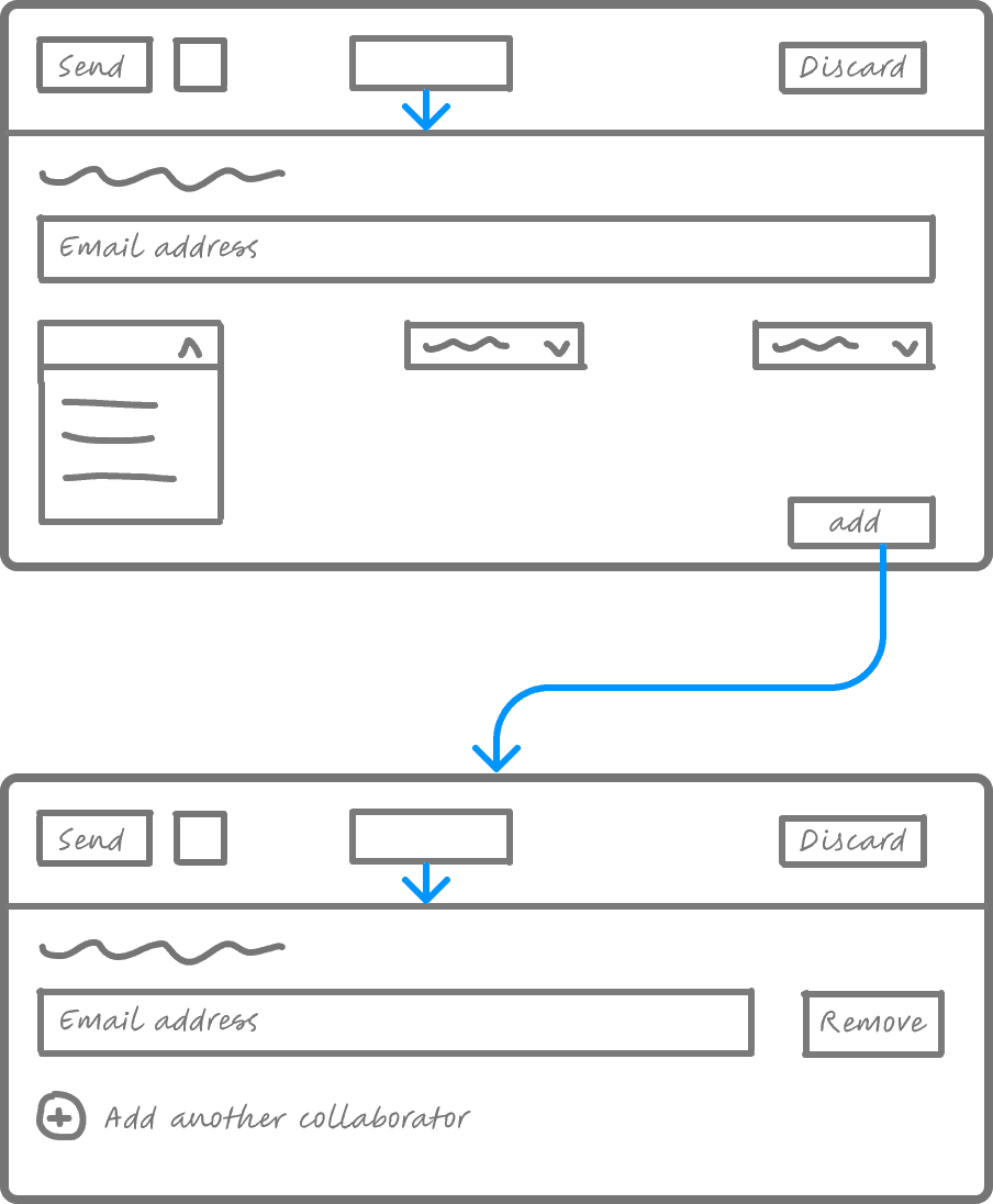
Modals
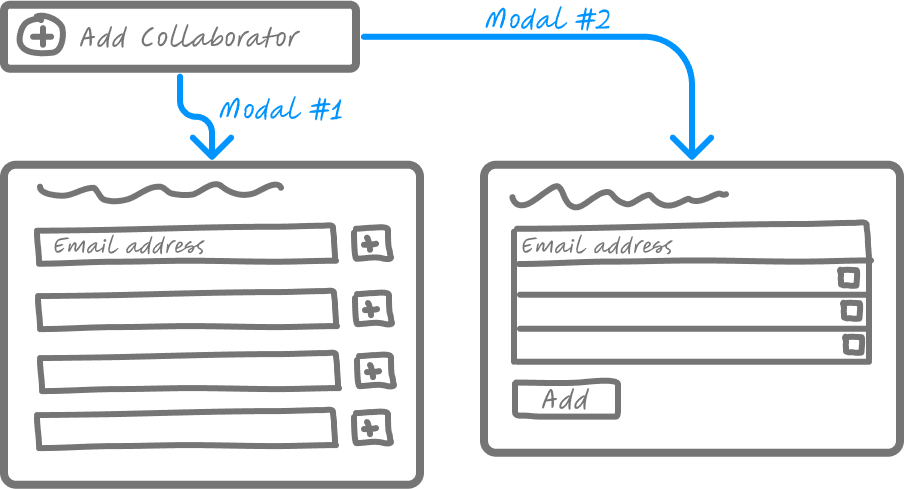
In the sketch below, I explore different ways modals could be incorporated to the design. I did not end up choosing this route to go with since modals can cause users to feel stuck, restricting access to the screen behind it. Additionally, because Microsoft uses modals for confirmation screens, it might confuse users to see a modal with an option to add collaborators to an email since it might lead them to believe that they might make an irreversible action.
Exploring modals
Button placement
How can I minimize the potential of user error? This question comes to mind after analyzing the results from testing when the Collaborate button was right above the Send button. Users mentioned how the close proximity of the Collaborate and Send buttons could lead them to accidentally click Send without the email being ready. I iterated after receiving this feedback by moving the collaboration button to the opposite side of the Send button to lessen the possibility of user error.
Iterating on button placement
Dropdown menus
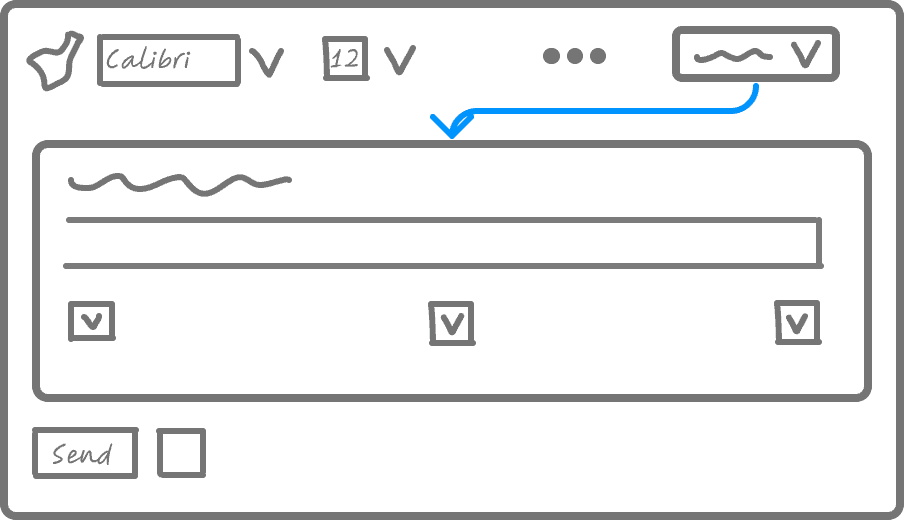
Dropdown menus were additional ideas I had regarding this feature. Would a dropdown be an easier way for users to navigate the design? Would this design choice become more frustrating for users in the event that they move their mouse away from the dropdown? After sketching a couple of examples, I brainstormed other ways to incorporate a section sandwiched between the row of editing functions and the Send/Discard row.
Ideas of dropdowns
Icons
Questions I considered:
1. Would users feel more priority to click on a button rather than an icon?
2. Which UI would be more familiar with users to interact with?
3. Is it more intuitive for users to see an icon rather than a button with text?
4. What would the feature look like if it were an icon?
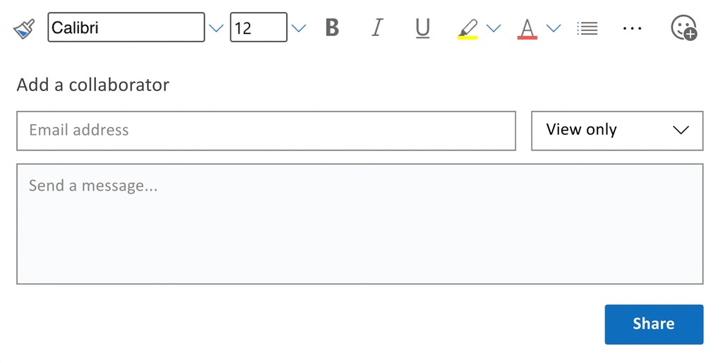
I dove right into these questions by designing possible ways as to how an icon could potentially elevate the design. The first idea I had was to add a face icon with a plus sign.
Playing around with a face icon
Unfortunately, the smiley face icon looked like it might indicate to users that they could click on it to add an emoji.
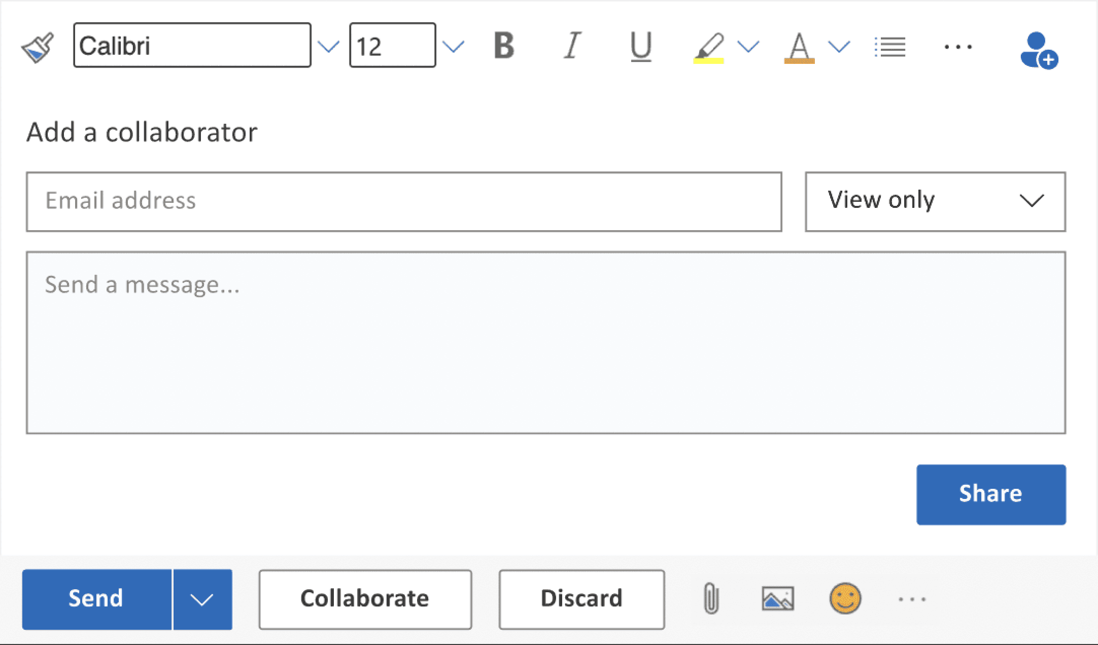
What if we changed the icon to a user with a plus sign?
Exploring user icons
Perhaps we should stay consistent with the Fluent Design System and give the icon a classic Microsoft blue fill when the user has clicked into the feature.
Adding a blue fill to the icon
The product
After exploring the different possibilities of how the feature could look, I got to work and created high-fidelity screens within Outlook. The flows I'll walk you through in this section are screens that I iterated on after testing.
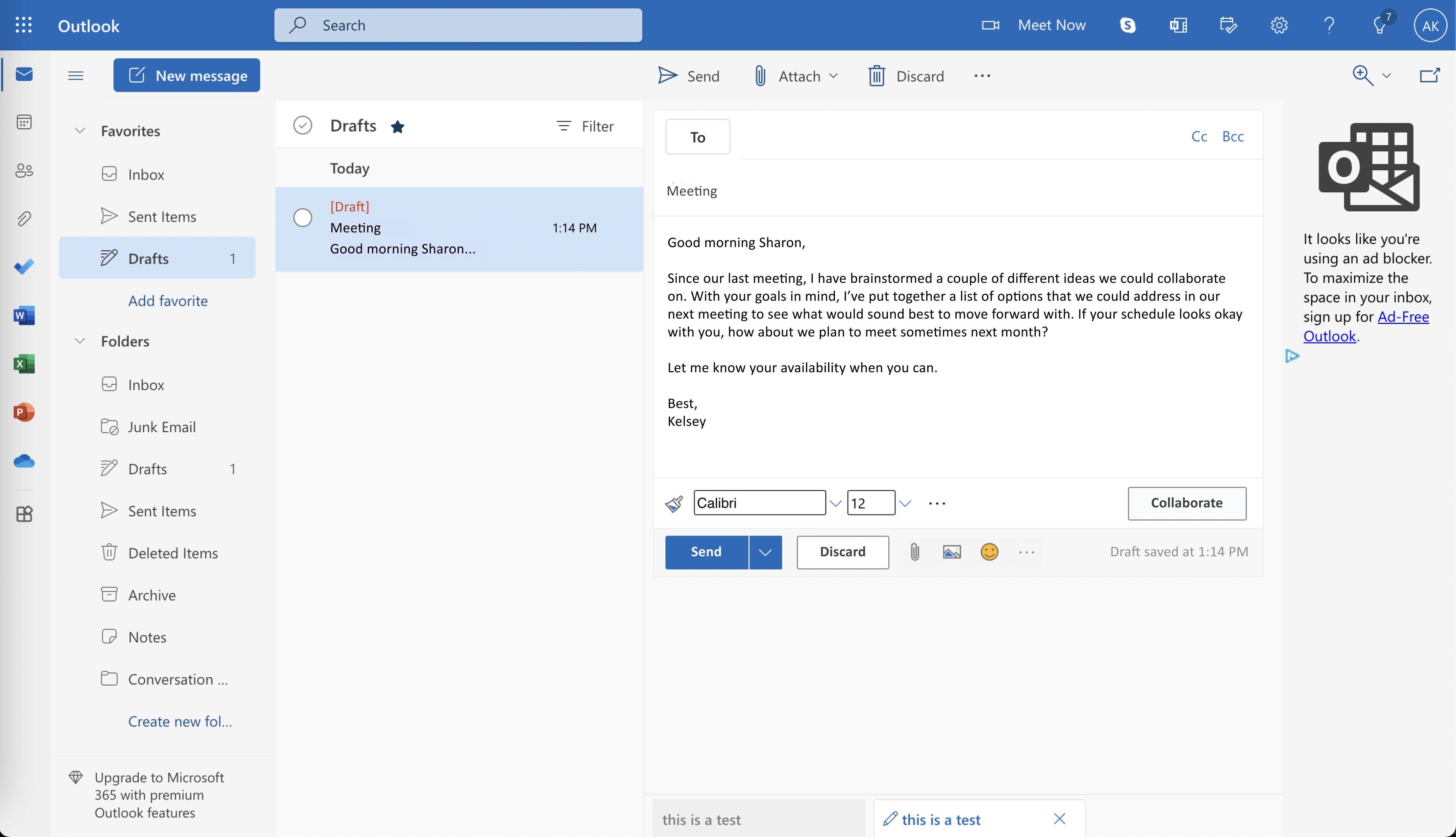
Creating a draft
Drafting an email
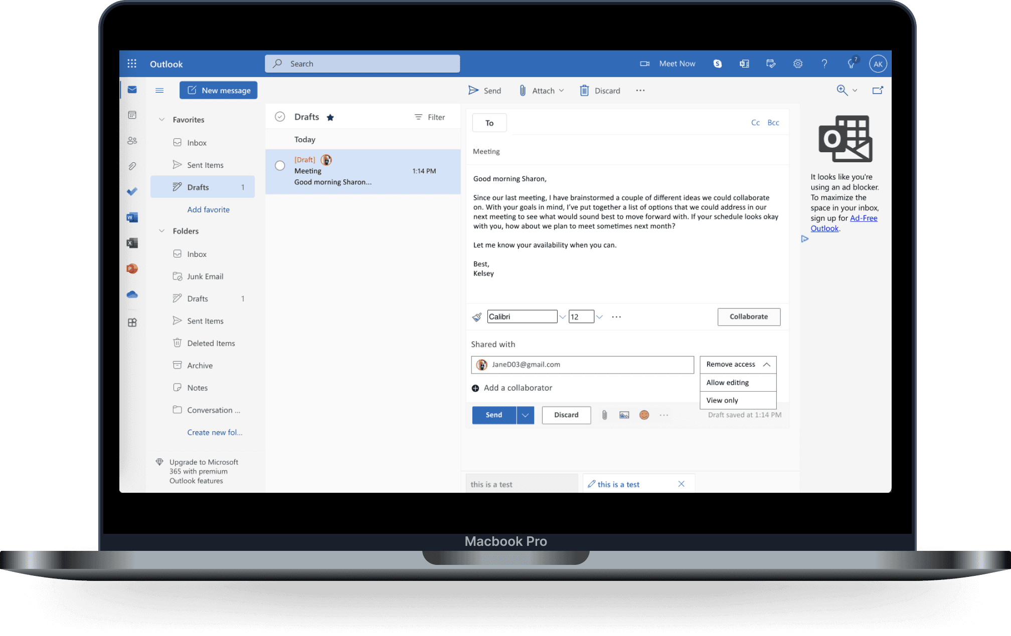
As a user creates a new email, the new collaborate feature gives them the opportunity to add others to view and edit their draft.
I chose to create the collaboration button to be on the right hand side to minimize the potential of user error where users might click send rather than collaborate on an unfinished email. It is also a secondary button to suggest that users have the option to collaborate on an email.
Adding a collaborator
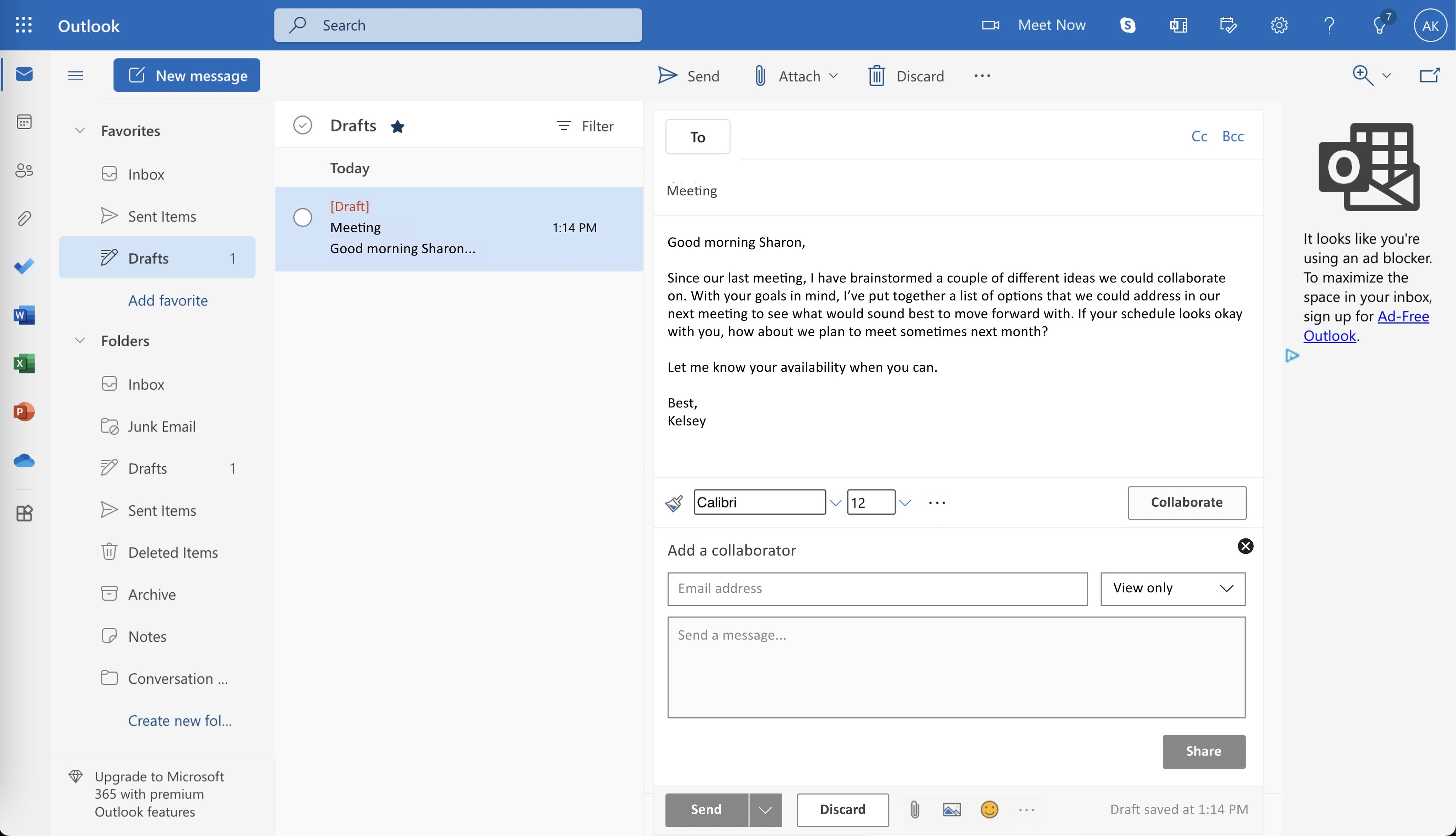
Clicking into Collaborate
Clicking collaborate expands a section that allows users to add a name or an email, type a message regarding the context of what kind of feedback they're looking for, as well as a dropdown that can control what permissions the user will assign the viewer.
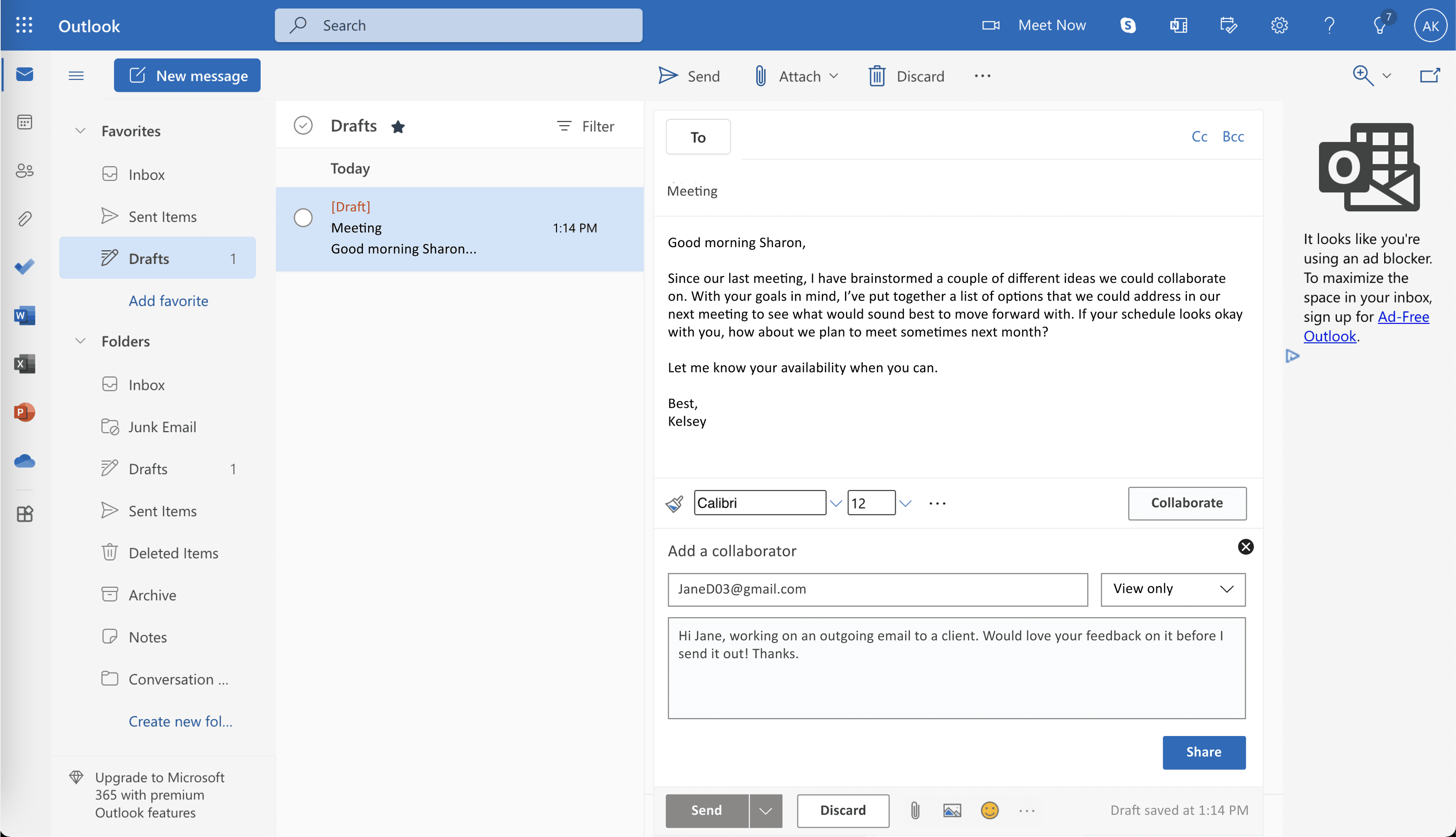
When designing this screen, I wanted the user to feel guided through the steps of adding a collaborator. For instance, by deactivating the Share and Send buttons, users will know that they won't be able to complete any actions until they've added the necessary information to activate the Share button.
Filling in the text fields
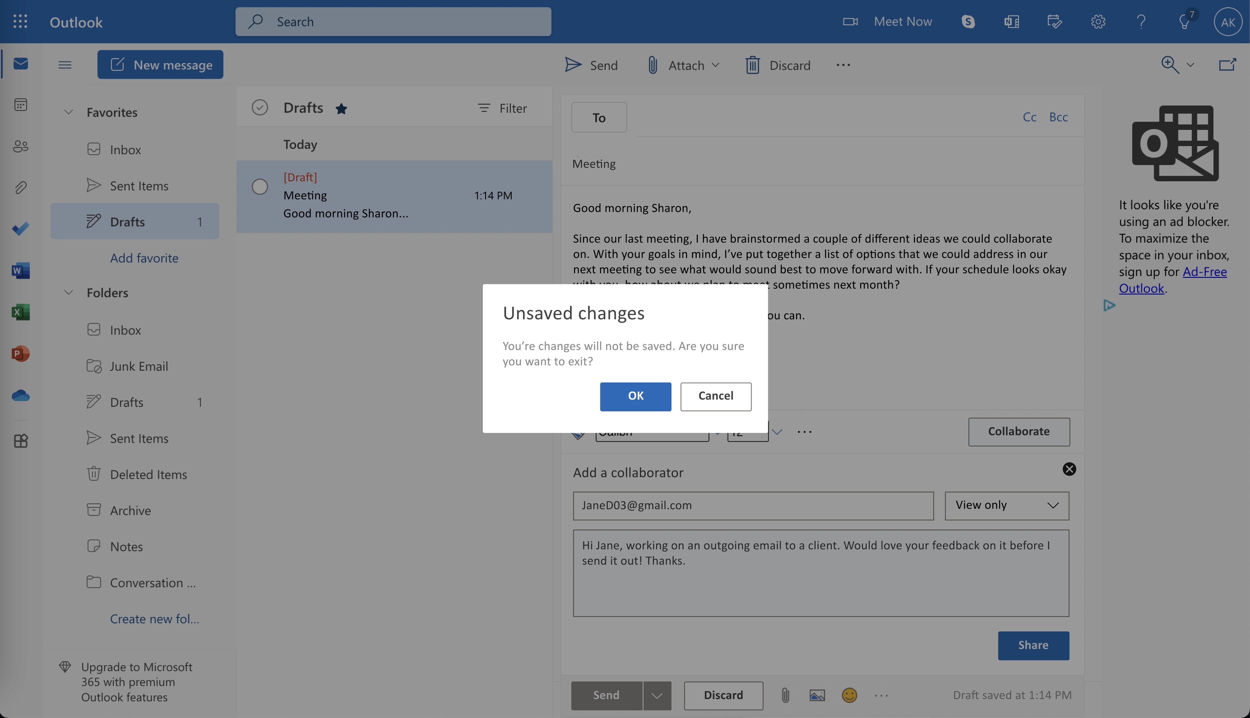
Additionally, after usability testing, I learned that it would be more intuitive to include an exit button that allows users to close the collaboration panel whenever they decide that a second opinion is not needed on an email.
Example of a user closing the feature
In the case that a user decides against adding a reviewer to their email, they can click close which will prompt them to a confirmation screen. The modal over a dark overlay gives the user a chance to click cancel if they don't want to discard their edits or if clicking the close icon was purely by accident.
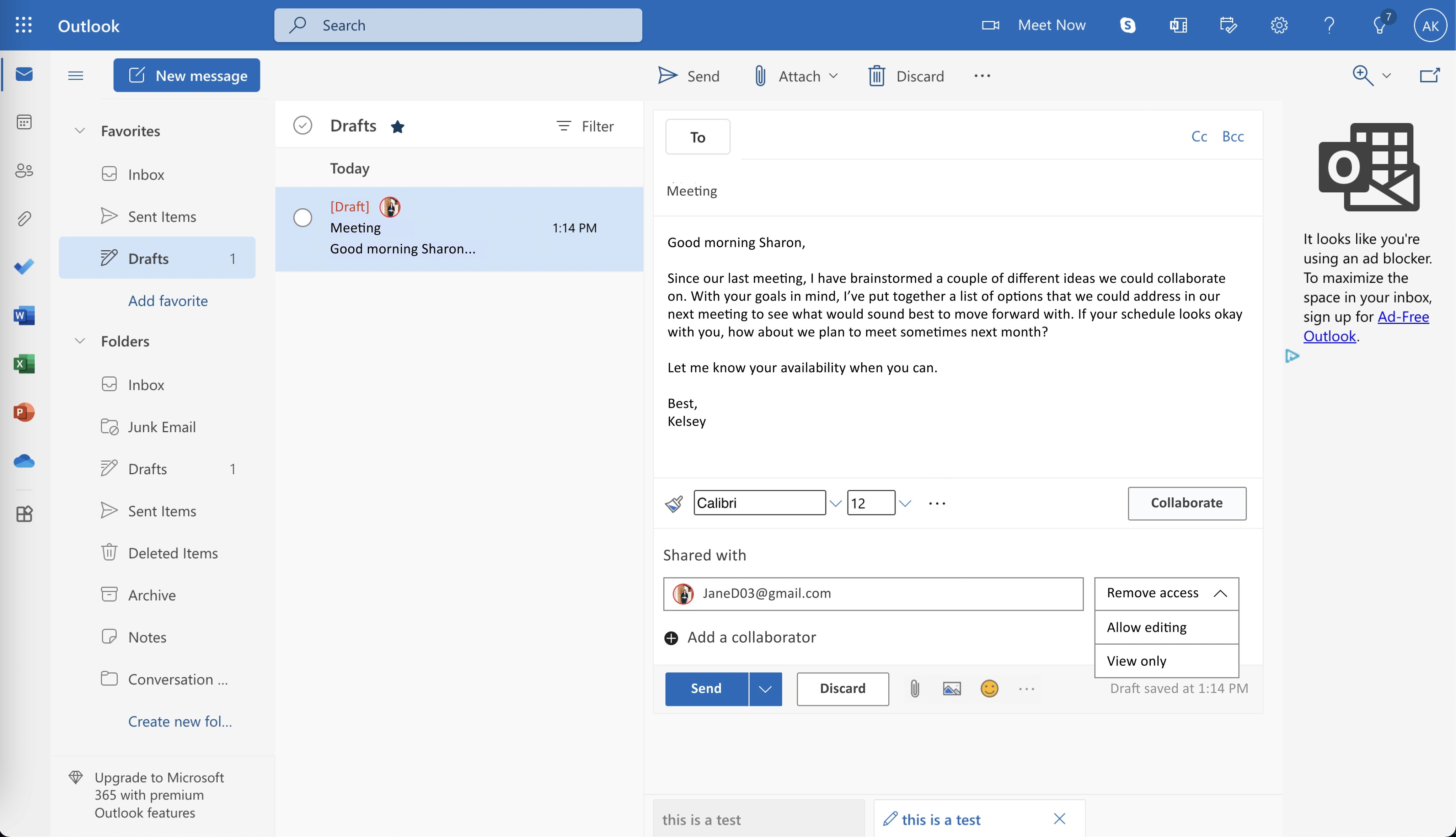
Collaborator added successfully
Once someone is successfully added to a draft, the Send button is reactivated and more options appear to the user such as adding more collaborators or editing permissions.
Editing permissions
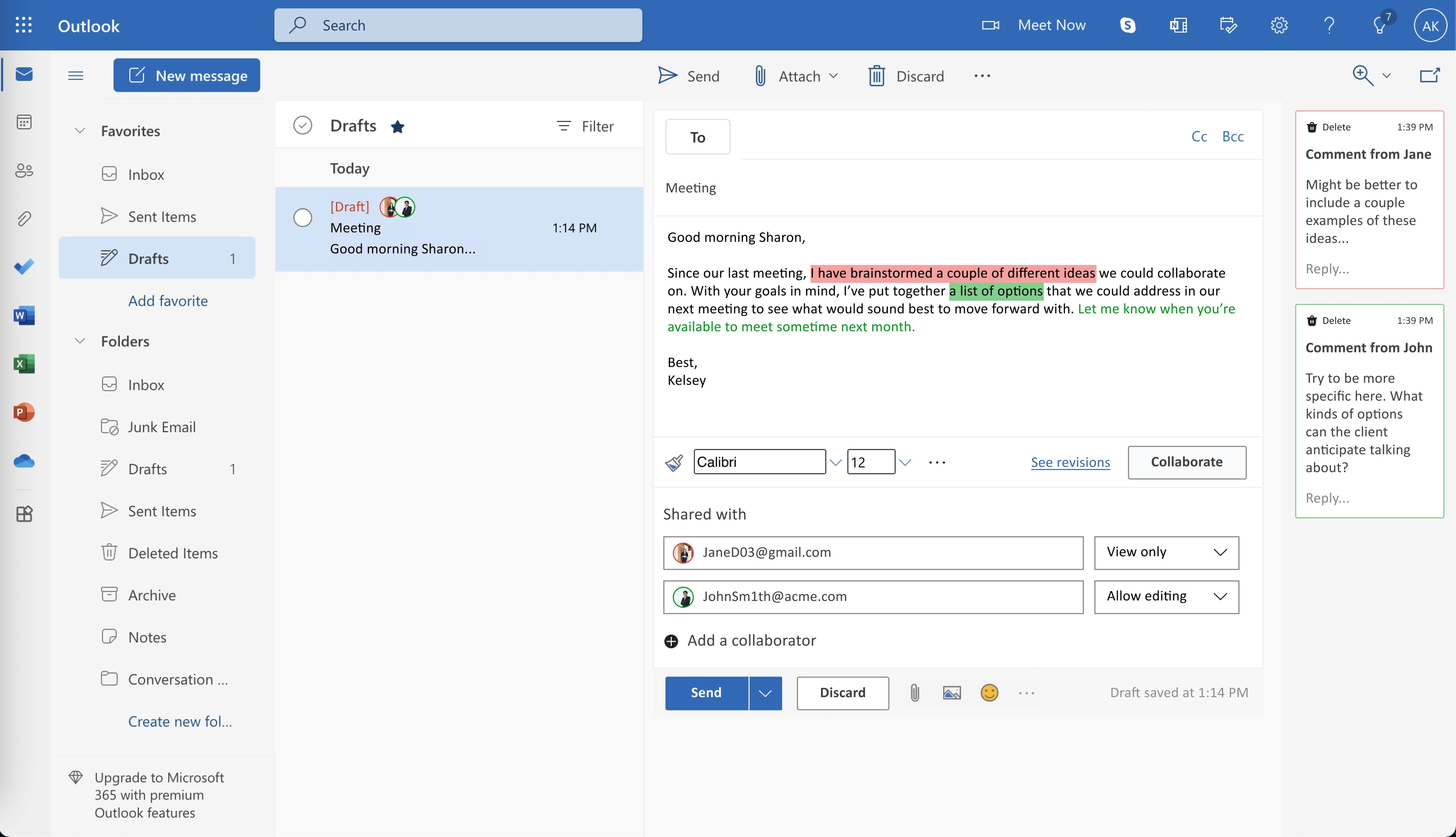
I've added avatars with a distinct color stroke in the inbox of their drafts folder to indicate to the owner of the email who they have shared their draft with as well as who made which edits.
Viewing collaborator comments and edits
In this case, the owner is able to see the different edits made as well as the distinct colors that are assigned to each viewer/editor. This allows them to determine what kind of feedback they have received in the content of the email or in the comment panel on the right hand side.
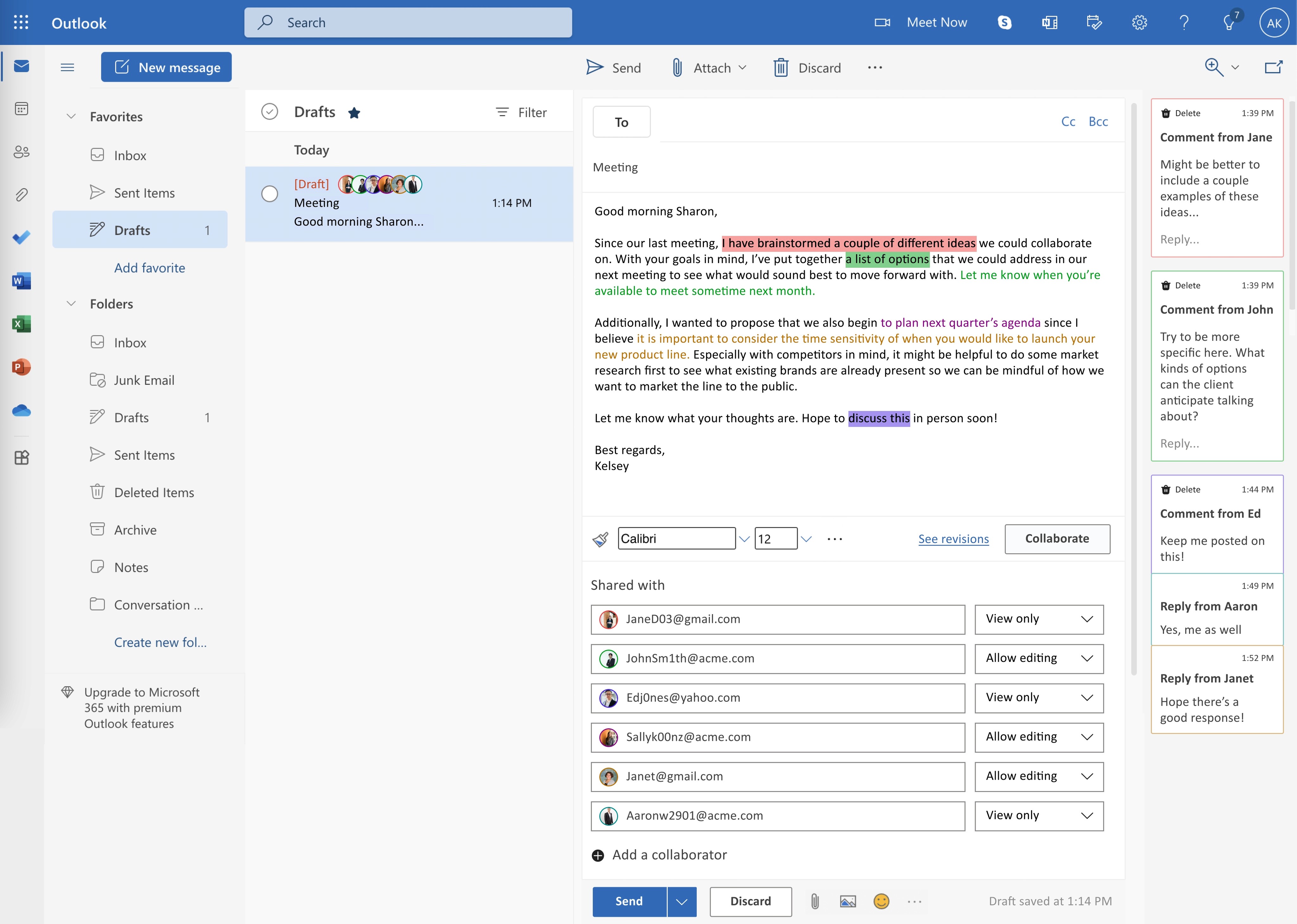
An edge case
Example of viewing multiple comments and edits
Although this may be uncommon considering how emails are usually short and concise, if a user decides to add multiple collaborators to a draft, they would be able to do so based on this screen. The edge case indicates how the interface would change based on 2 collaborators or 7 collaborators.
Learnings & takeaways
Learnings & takeaways
Iterations
Although most users rated the product to be intuitive, users also communicated some confusion regarding the initial stages of the collaboration button and how to navigate it. I responded to this feedback by iterating on the screens (as seen in the flows above) to give users an option to close the collaboration feature while also deactivating buttons (Send, Collaborate) to give users more guidance on how to navigate the feature.
As mentioned in the exploration stage, I also iterated on the button placement to minimize the possibility of user error from spacing the collaboration button too closely above or next to the send button.
Version 1
Iterations
Current version
Testing
My solution to the visible edits and comments were to add an overlay with a modal confirming that these edits would not be visible to the receiver once the email was sent. With time, I'd like to continue exploring the design to see if there is a better solution than a confirmation screen. Additionally, I am curious to see outcomes from A/B testing if users were given screens with a collaboration icon versus a collaborate button.
