Puffin Air Purifiers - Brand Refresh
A visual identity refresh for an early-stage air quality startup focused on translating lab-grade CO₂ capture into a consumer product.
Overview
Puffin Air Purifiers is a science-driven startup bringing advanced CO₂ capture technology into the home to improve indoor air quality.
The goal of this project was to refresh Puffin’s brand identity to better balance scientific credibility with warmth and approachability, and to reposition the brand as a consumer-facing product rather than a research concept.
My role
Scope
Logo redesign
Brand narrative and positioning
Color system and typography
Visual direction for web and product touchpoints
Constraints
2-3 week deadline
Integrate existing typography
Utilize periwinkle color in branding
Role
UX/UI Designer
Brand and visual identity
The problem
Puffin’s original branding leaned heavily into playful, cute imagery, but lacked a strong conceptual connection to air quality, sustainability, or the product’s function.
The existing identity:
Felt more like a character graphic than a meaningful symbol
Did not clearly communicate clean air or environmental impact
Was visually complex and difficult to scale across platforms
Skewed juvenile rather than credible for a consumer product
Before

The original logo featured a static puffin holding a balloon, which evoked playful and childlike associations but did not meaningfully reflect air quality, sustainability, or the brand’s mission.
After

The refreshed logo features a puffin in flight, evoking fresh air, clear skies, and natural movement. This gives the symbol a sense of purpose and action while preserving Puffin’s cozy and home-oriented feel.
The simplified puffin form can also be interpreted as a cloud, creating a subtle dual meaning that reinforces ideas of air, atmosphere, and softness. The original light purple palette was retained for brand continuity.
Key design decisions
Brand goals

From character to symbol
The puffin was redesigned to function as a symbol rather than a mascot, representing motion, air, and environmental impact.
Balancing warmth and credibility
Visual elements were softened without becoming childish, allowing the brand to feel approachable while remaining trustworthy and science-forward.
Designed for scalability
The new logo system was simplified to ensure legibility and consistency across:
Web and mobile
Marketing materials
Packaging and future product surfaces
Visual system
Logotype layout variations
Multiple logo layouts were created to support different use cases, including extended and compact versions for flexible placement across digital and physical contexts.
Logomark

Logo extended


Motif
The puffin body was reused as a cloud motif, reinforcing themes of air, lightness, and atmosphere throughout the brand system.


Typography
Parisine Plus was selected as the primary typeface to strike a balance between friendliness and clarity. Its rounded forms support Puffin’s warm tone while maintaining strong legibility for product and marketing use.

Color
The color system is based on a triadic harmony, centered around periwinkle tones inspired by natural environments.
Primary colors include:
Puffin Purple
Sunset Orange
Iceland Green
This palette supports a visual identity that feels energetic, fresh, and environmentally grounded.

Primary & secondary colors

Color guidelines

Brand gradients


Impact & value
This rebrand helped Puffin:
Transition from a research-driven identity to a consumer-facing product brand
Establish a cohesive and scalable visual system for future growth
Communicate scientific credibility without feeling sterile or overly technical
Build an emotional connection with users through warmth, symbolism, and clarity
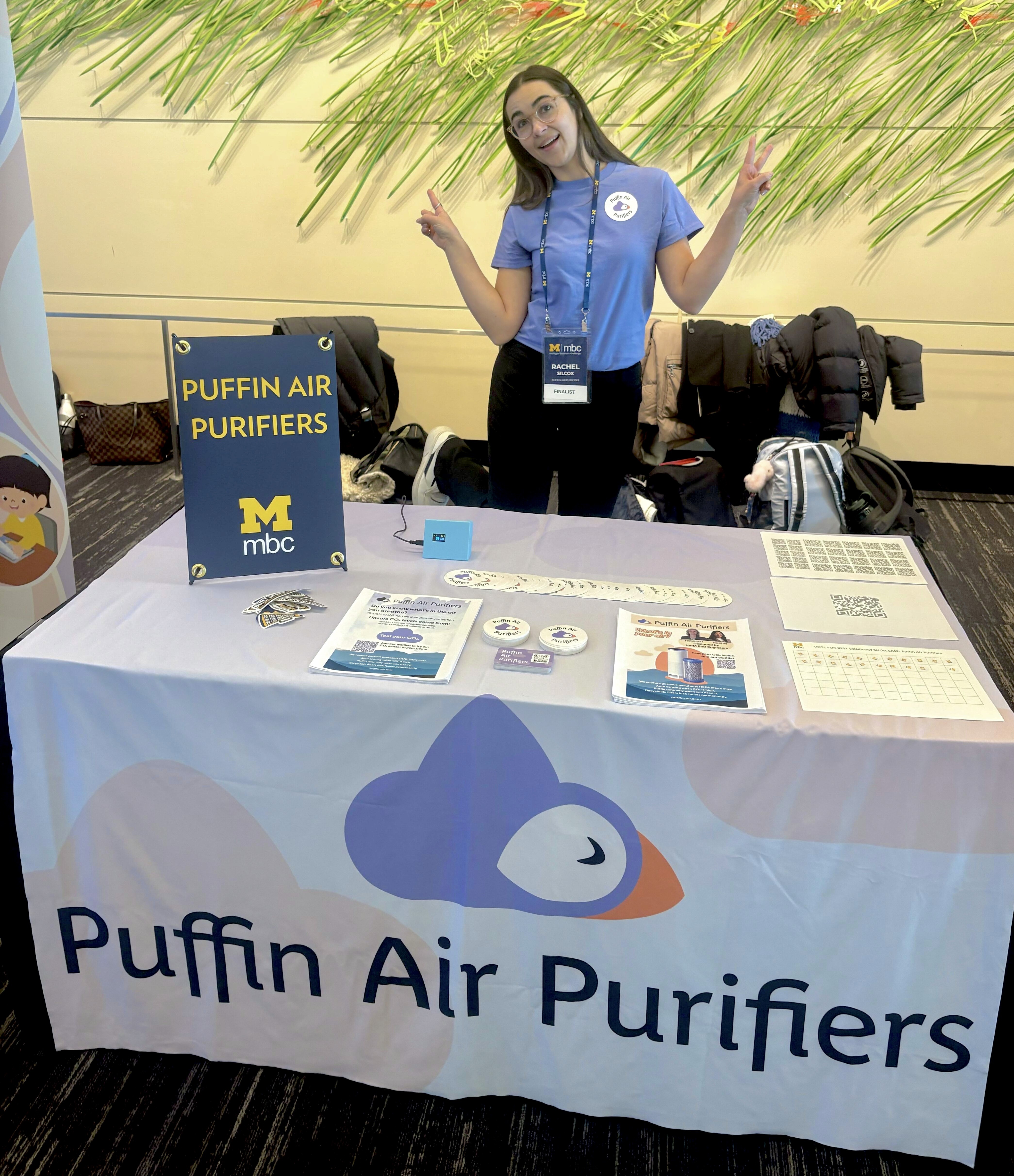
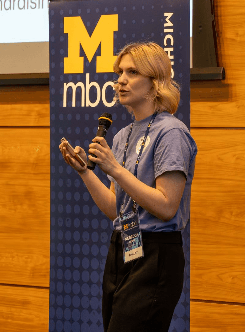
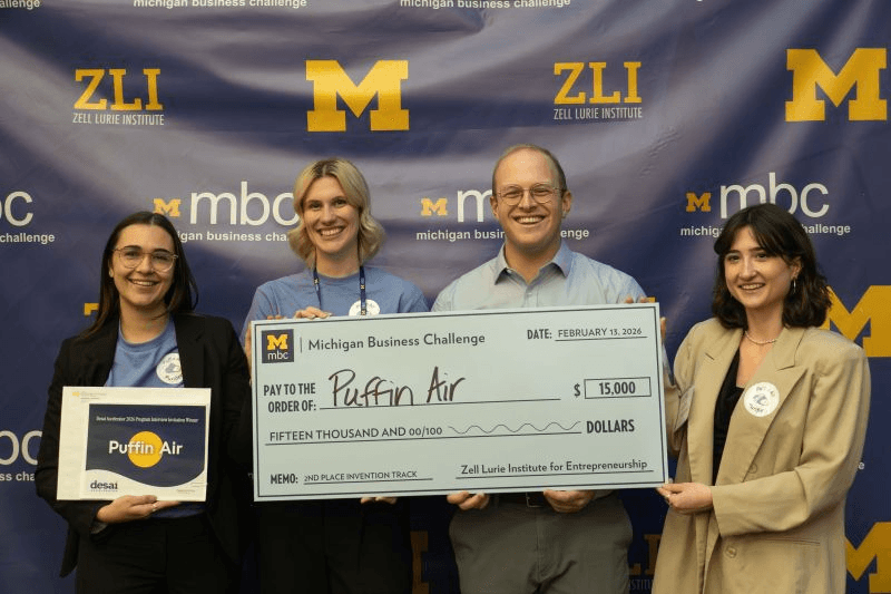
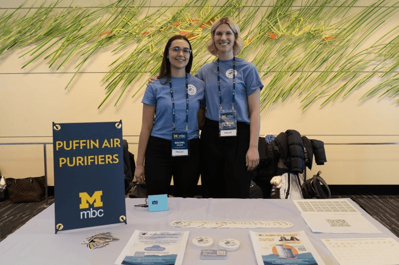
The full rebrand was immediately rolled out across business cards, stickers, tabling materials, pitch decks, and the website. The refreshed identity strengthened their presence at competitions, contributed to a second-place finish, and supported their fundraising efforts by helping attract investor interest and secure early-stage funding.
The refreshed brand now provides a strong foundation for Puffin’s website, pilot program, investor materials, and future product design.